
Questions:
● Explore the AutoSum functions with other data fields. How do these calculations impact or inform your understanding of the data? What questions do you have about the data or calculations?
● What types of visualizations were you able to generate in Excel using PivotChart? How could those visualizations shape or impact your understanding of the data? Did you generate any visualizations that were confusing or misleading? Alternatively, did you generate any visualizations that were unexpected or illuminating?
Context:
The Vivero fellows were instructed to downlaod an Excel file containing Grinnell Census Data from 1870. This file has information about people who lived in Grinnell at the time, such as: age of male/female householders, family literacy, country of origin, etc. We were then told to explore Excel and play around with the data to learn about how we can use Excel for data visualization and analysis.
Reflection:
These calculations can give an overview of trends in the data that we wouldn’t be able to see using only one data point. And the visualizations help see possible correlations between the data points.
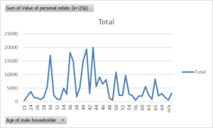
I generated a confusing visualization whenever I used “count” instead of “sum”. Additionally, averages can be misleading whenever one of the values is an outlier. Medians can be more helpful. The line graph I created was illuminating. It showed that wealth didn’t grow linearly with age, and made me think of the role generational wealth, immigration, and loan policies played in the economy at the time.
Leave a Reply